Thursday, 16 December 2010

CLASH OF THE TITANS

A really interesting read from Reve News.


Moore, C. T (2010) Google vs Facebook in 2010: A Blow-by-Blow Review (Online) accessed 16/11/10, available at http://www.revenews.com/ctmoore/google-vs-facebook-in-2010-a-blow-by-blow-review/


"Given how Facebook has grown in the last year, it’s no surprise that Facebook is perceived as Google’s new rival. While the company’s $1.28 billion in projected revenue pales in comparison to Google’s earnings, Americans spend only 138 million hours a month searching compared to 906 million hours on social networks.
Needless to say, the year has been interesting for both Facebook and Google. The two have duked it out in their own version of David and Goliath. And while Facebook seems to be winning on the location-based services (LBS) front, Google appears to have an edge in eCommerce.
The Year in Review
In any case, here’s an overview of how the two tech giants competed over the year. If I’ve missed anything, feel free to leave a comment and we’ll update the post to include it.
February 9, 2010 – Google launched Google Buzz and is suspected of suffering Facebook envy.
April 21, 2010 – At the f8 conference, Facebook announced the Open Graph API, making Facebook Connect (and the “Like” button) a standard part of our web-browsing experience. Facebook now collects data on our surfing habits, and third parties now have access to our Facebook data.
June 28, 2010 – Facebook poached Matthew Papakipos from Google. Papakipos led the Chrome OS project, leading to speculation that Facebook is working on its own OS.
June 29, 2010 – Rumors about Google Me are confirmed by Facebook’s former CTO.
August 18, 2010 – Facebook entered the LBS market and launched Places, effectively relegating Foursquare and Gowalla to mediocrity.
September 14, 2010 – Eric Schmidt confirmed that Google Me is real and will appear as soon as Fall 2010. He also elaborated that, instead of competing directly with Facebook, Google Me will consist of a “social layer” that will be applied to existing Google services (but see November 30).
October 4, 2010 – Facebook Open Graph gained added legitimacy when the second most popular comparison shopping engine, TheFind (number two behind Google), undertook a major Facebook integration (making them a super-social affiliate).
November 3, 2010 – Facebook took its LBS offering (Places) to the next level and launched Facebook Deals. Now Facebook users can be offered deals for checking into local business, meaning that (1) there’s now an incentive to use Facebook Places, and (2) Facebook makes more inroads into location-based advertising.
November 4, 2010 – Google changed its API terms to restrict Facebook from letting its users import their Google contacts since Facebook offers no reciprocal way for Google users to import their Facebook contacts. The Battle of Data Portability begins.
November 5, 2010 – Facebook ignored the change in API terms.
November 8, 2010 – comScore reported that Facebook served up 23% of all U.S. ad impressions in Q3 2010 compared to Google’s mere 2.7%.
November 10, 2010 – After Facebook found a workaround to Google’s API restrictions, Google raised awareness about data portability and lashed out at Facebook’s privacy terms by giving users a warning message that asks them if they’re sure they want to import their contacts into Facebook.
November 15, 2010 – Google struck back at Facebook Places and launched Hotpot, a location-based recommendation engine that not only let’s you share where you are, but also where you decided to go.
November 15, 2010 – That same day, however, Facebook set its sights on Gmail and announced Facebook Messages. The service is supposed to offer “seamless messaging” by letting “you decide how you want to talk to your friends: via SMS, chat, email or Messages.” Although Facebook will be offering an @facebook.com email addresses to all their users, Facebook stressed that Message is not email, but modeled more closely to chat. The service is still in the process of being fully rolled out.
November 15, 2010 – Probably the busiest day in the year-long battle between Facebook and Google, the search giant announced improvement to its product search that include local availability, popular products, and a feature called “aisles.”
November 17, 2010 – Google countered Facebook’s inroads with shopping sites and launched Boutiques.com. Powered by visual search technology that Google acquired from Like.com, the site is supposed to provide a personalized shopping experience.
November 19, 2010 – Hitwise reported that (in the week ending November 13) Facebook generated nearly 25% of all page views in the U.S., more than double that of Google and YouTube combined.
November 29, 2010 – Rumors surfaced that Google acquired Groupon for $2.5 Billion.
November 29, 2010 – That same day, Mashable broke that Google Me will be delayed until Spring 2011.
December 3, 2010 – Only four days later, confirmation leaked that Groupon rejected Google’s offer, and that rather than $2.5 billion, the search giant actually offered $6 billion.
December 4, 2010 – A report surfaced that Sergey Brin is directly involved in the development of Google Me and that it will be more of a Chrome add-on or toolbar instead of a conventional social network. Alternative names are also said to include Google +1 and @Google.
December 15, 2010 – - Google Me is said to be delayed by political infighting and will, indeed, be called Google +1.
December 15, 2010 – Time named Mark Zuckerberg Person of the Year.

What Comes Next

The past year has been an interesting one for both Google and Facebook. While we can’t be sure what the future holds, it’s hard to imagine that Facebook will not continue to grow.
What is certain, however, is that Facebook has an edge in the LBS space because they have an established social, user base. Google, on the other hand, exists in a social vacuum. And while Google seems focused on eCommerce, it’s also no stranger to failure.
What 2011 will bring, we don’t know. Maybe it’ll be Google Me/+1, maybe not. Maybe Google will begin its descent to Yahoo/Ask status. Maybe Android will help Google catapult ahead of Facebook to a place where data is portable, and the web is mobile. Whatever the future holds, it will be exciting to see what comes next for these industry leaders."
(Moore, 2010)

Monday, 13 December 2010

One In Ten Of Your Friends Will Not Be Human By 2015

Human or bot? That will be the question to ask about your friend lists online. By 2015, about 10 percent of these contacts will be nonhuman, predicts the Gartner Group.


Don’t misread “nonhuman” here. We’re talking about bots.  Right now companies employ humans to promote brands through profiles and pages. By mid decade, this will get fully automated.
Like “Gartner’s Top Predictions for IT Organizations and Users, 2011 and Beyond: IT’s Growing Transparency” explains:
By 2015, efforts to systematize and automate social engagement will result in the rise of social bots — automated software agents that can handle, to varying degrees, interaction with communities of users in a manner personalized to each individual.
This trend may seem harmless on its own, but not when security issues enter the discussion. If one in five users have encountered malware on Facebook already, in half a decade bot friends might unleash more widespread damage.
Today the average user has about 100 or so friends, and that’s supposed to reach 500 in the not-too-distant future. The typical Facebook account could have 50 bots mixed in with real human contacts. That could open a big can of whoop-ass if people don’t learn to screen friend requests.
Certainly, bots could hold great promise for viral marketers, especially with Facebook rejiggering word-of-mouth promotional features just when they’ve built up momentum. 
Companies that bot themselves might build more trustworthy brands by avoiding the use of malware and possibly disclosing that to the public. 
Bots as profiles might also become a frontier for privacy debate if the automation ever includes the ability to chat with other users as way of gathering demographic data.
Of course, this is all hypothetical because none of this technology has been invented yet, as far as we know.

Cohen, J.  (2010) One In Ten Of Your Friends Will Not Be Human By 2015, (Online) All Facebook, accessed 13/11/2010, available at http://www.allfacebook.com/report-one-in-ten-of-your-friends-will-not-be-human-by-2015-2010-12

Tuesday, 30 November 2010

An online failure - H&M's defeat at the hands of loyal consumers


Last Tuesday, the 23rd of November, the world waited in suspense for the opening of the Lanvin collaboration with high street retailer, H&M. Thousands sat astute at their laptops, yawning at the 6.50am clock, waiting for the website to switch from 'This collection can be bought from 7am on the 23rd November' to a more exciting 'Buy online right now!' whilst thousands of people, all over the UK, alas, all over the world, waited for their chance to burst through the H&M doors at 9am.

The collaboration had been promoted for months previous, leading to a consumer frenzy when the days grew closer. The exclusivity of owning a Lanvin dress is given only to those who have over £2000 to spend on a designer dress, yet this collection was designed as a way for the public to get their hands on a Lanvin piece for under £100, hence the frenzy.

The womens collection consisted of couture inspired dresses and skirts, sophisticated jackets, cute abstract t-shirts, stunning stilettos and accessories, all for under £150. For those who love fashion, it was something to be excited about. For H&M and Lanvin, it was obviously going to be a huge success, and something that needed to be managed and organised correctly. For the most part, H&M should be given credit for the organisation and management of their stores, yet, their online services left much to be desired.

Not often am I one to look negatively upon H&M nor online retailing as a whole. The retailer never fails to deliver on trend, fashionable clothing at lower prices that match the quality of their garments. Online retailing is my channel of choice when shopping, call me a convenience shopper, or just plain lazy, but I prefer it hands down. However, the dissapointment I felt last Tuesday morning at the hands of both H&M and their online retail strategy ushered me to write about the saga.

As many others, I was sat in front of my mac at 6.45 am, loading the H&M page, waiting, hoping, praying that I might be able to catch a Lanvin bargain. Not often am I awake at that time, just to help you understand my extreme desire to own a piece of Lanvin. As 7am approached, and the site switched from ordinary to all teams Lanvin go, the site went into a state of panic. Gone was the 'This collection can be bought from 7am on the 23rd Novemeber' and in its place was the following...
I understood that the site would be popular, and the site would be overly crowded and of course I didnt want to miss out, so as instructed, i tried again. and again. and again. Refreshing the page for 30 more minutes until finally I managed to access the site. The majority of stock, of course was already gone, yet to my extreme excitement, the Lanvin T-Shirt that I wanted alongside some heels, a dress and a skirt that I had previously chosen, was still in stock. I quickly rushed to put it in my 'shopping basket'.

Smiling away, proud of myself for finally gaining access to the site, although many more had not yet gained that priviledge, I moved from the product pages to the checkout section of the store, though the checkout page was broken. Error messages called out from every mouse click, and me and my Lanvin T-shirt were getting nowhere. I reverted to twitter to see if others were in my predicament, and I was reassured that many more were in the same position as I, still waiting after 2 hours, to purchase a product from the site. After another 45 minutes of waiting for H&M to fix the checkout, the site refreshed, I went to purchase and my top, was gone... 'This product is now sold out.'

You can imagine my mood. I again went back to twitter, and others were reporting that their products had also gone astray, yet much to my annoyance and disbelief, there was no communication coming from H&M directly. There was no, 'Were sorry that the site is broken', 'the site is overcrowded, please keep trying' or any reassurance of any kind. H&M had forgotten their online consumers in their quest for record sales.

I understand that not every site can bear the weight of thousands of individual users, searching and purchasing from a range of 50 items. Yet, H&M should have had technicians on site, working at the functionality of the site throughout the entire process. Such a massive event, called for a massive amount of man power. If there was nothing more they could do on the site, they should have then reverted to their portals of communication, i.e. their facebook, twitter, blogs etc and apologised, reassured and sympathised with their upset, loyal consumers. It was this lack of communication, almost as though the H&M staff had left their head office for a coffee, that really got under my skin. With such an influential and direct communication portal as social networking sites, the situation could have been smoothed over within minutes.

This should add as a lesson for every retailer. If you are going to create a media sensation, then make sure you have the tools to deal with the uproar. Put in place a robust website, with the ability to hold high amounts of traffic. Make sure every link on your page is working perfectly, before and during the launch of any event.

And mostly, if the worst does happen, make sure you utilise your cheapest and easiest methods of consumer communication. Relationships with consumers is the backbone of your company, do not take it for granted. A few polite words is enough to reassure your consumers that you are trying your hardest to make them happy.

...

Afterthought,

Although upset with H&M and with reduced loyalty for the brand, I followed my friends into a H&M store one week after the Lanvin launch event. Perusing around nonchalantly, I stumbled upon one clothing bay, beneath a sign reading...


As my eyes opened wide, I spotted the black stiletto heels that I had tried to buy as a Christmas present, and in some heavenly way, they were in my size. The last pair of heels in my size possibly in the whole country, and they were sat within my reach, just waiting for me to buy them. And buy them I did, faster than you can say Lanvin and H&M. H&M had put a smile back on my face.


More on this from this blog, written by an SEO executive at a digitial marketing company, Manchester...

Friday, 26 November 2010

Virtual Magazines. Something we've only dreamed about!

I don't know if I speak for myself in saying this, but when reading fashion magazines and viewing all of the inspirational images of trend-led fashion items, I always wished there was a way of buying the product straight from the page. As if somehow tapping the bag on the shoulder of the model would apply it to my shopping bag and I could buy an outfit as it was shown to me. I'm sure everyone has said 'Where can I buy that from' at some point or other when flicking through Grazia or Vogue. Well, this exuberant fantasy has finally and miraculously come true with the arrival of the virtual magazine.

I was so excited when I read an article on the Vogue website informing their readers that they could soon purchase the Vogue magazine via their Apple iPad:

"VOGUE is launching an iPad app - the December issue will be available on iTunes from November.Vogue's editor Alexandra Shulman and creative director Robin Derrick are currently working with Spring Studios and Six Creative to re-imagine the fashion bible for a iPad format." - (Alexandra, 2010) - http://www.vogue.co.uk/news/daily/100916-vogue-launches-ipad-app.aspx.

The idea of flicking through pages of gorgeous imagery and designer fashion in the brightest colours possible without the fiddly pages, magazine pull outs and worries of accidentally bending the spine, is my idea of magazine heaven. The issue is available via the Vogue UK iPad app and costs £3.99. 

However, although the e-reader allows the purchase of traditional magazines online, including Vogue, GQ and Wired, it has also helped establish retailer magazines. The perfect example and one that I absolutely adore, is Net a Porter.

Net A Porter have already established an iPhone app that allows users to buy products straight from the app. However, they have not to this day designed an iPad of the same functionality. Yet, in my eyes, they have gone one better, creating the inspirational and interactive Net A Porter magazine app. 


The image above demonstraes the homepage of the app. A very minimal and sophisticated feel to represent the brand image and personality. A graphic placed to the left suggests some of the magazine content and creates an air of designer fashionability. The layout is representative of both a magazine format and an online page, commingling the two into an exciting hybrid. 


The magazine has 47 pages, each split into two, creating a total of 94. However, double page spreads are used most prominently in order to create full product pages and to utilise the small yet sufficient space. The contents page allows the user easy access to any of the magazine sections...


...and for easy movement between pages, the 'Contents' button allows the user to flick along the pages in a scroll bar movement. 


Like a traditional magazine, the Net A Porter magazine also uses fashion advertisements, as an endorsement opportunity. Below is an example of a Stella McCartney advertisement placed within the magazine...


and of course by clicking on the image of the lady, you can buy from the Stella McCartney range. 


The intuitiveness and interactivity of this app is better than any app I have seen as of yet. 
Let me show you some further fantastic pages... 

Below is a product page, three products styled together with an adjacent background, creating an inspirational product viewing.


and yes, you can buy the products directly from the page with the 'Add to Shopping Bag' button. Now £435, don't mind if I do thanks. 


Again another gorgeous product viewing page in a similar style with magazine style copy to inform the user of the nature of the collection. 


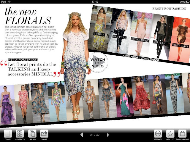
The magazine format is apparent through pages such as the one below. An assortment of garments, styled together with graphics, copy, and style tips, with a connecting product video 'Watch the Video'. Each product is also a button that can be pressed in order for the user to purchase straight from the page. 


Again in the true nature of magazines, there are visual product shoots, where the products can be bought directly...


and trend pages, yet interactive and customised. By choosing one of the trends in the top row of images, the central model image changes as does the text and copy to apply the selected trend. The bottom row of images changes to reflect the trend and to allow users to buy certain pieces that the retailer stocks. 


The page below is stunning. The five models in a row here are all videos that automatically show the the models walking down the catwalk on a loop. I make reference to my previous blog post about the uptake of video. Please pay attention.


Audio has been implemented also, as you an see the audio button in the top right of this next image. 


I wish I could blog each and every page of this magazine as they are all so beautifully designed, yet it would take away your enjoyment of viewing them for yourself. 

If you have an iPad, get this app straight away and flick through each page to gain the overall elegance and quality of this innovation. If you do not have an iPad, this app is reason enough for you to go out and buy one straight away. Have fun!

Victoria Magrath, 26/11/2010. 

Thursday, 11 November 2010

Video Communication to take over Social media?

When ASOS began showing us their brand new products in a 3D format, draped over a gorgeous size 8 brunette, strutting down a studio catwalk to the awkward drums of a underground indie pop band, I speak for the majority when I say it changed the way we appreciated product viewing. It raised the bar for other fashion retailers, and not many have crossed it, let alone come anywhere near it. 


Enter Knickerpicker.co.uk.


Knickerpicker is an online lingerie retailer established on the web a few years ago. There short but sweet 'about me' section explains this brand much better than I could.

"Here at knickerPicker we believe shopping should be fun and shopping online should be no different. That's why we created the first interactive video dressing room with a fabulous choice of models.

We understand that no matter what size you are, you are looking for beautiful lingerie. We are committed to stocking the best lingerie brands in sizes from 32AA to 40HH so that you can look fantastic whatever your size or shape."

That is it in a nutshell. The website offers consumers the first interactive video dressing room, equipped with gorgeous women in differing sizes and shapes, in order for the consumer to match their body to the models to gain a better idea of how the lingerie will fit.


The image above demonstrates how the interactive dressing room works. I chose this black bra from a selection of branded bras. The user can click the main image and zoom for details and is offered matching garments below as an add-on incentive. However, the special part of this website is shown on the right hand side of the page. The model, who I have chosen out of a choice of five, walks onto the page from the right (out of video shot). I can then use the command buttons to move the model forwards, backwards and to turn her around nearer to the camera or further away.It gives the user an interactive viewing of the product they desire, allowing them to interact with the site and view the product the way they want to. They have control over their product viewing.

The video below is an example of how it works.


This new form of product viewing is helping retailers to communicate much more successfully with their consumers. Some marketing companies are beginning to see video communication tools accelerate and grow in a way that suggests they will soon take over social media and networking as the primary marketing effort. Many marketing companies are becoming inundated with retailers and businesses seeking help and suggestions of how they can use video communication media to their advantage, suggesting that video communication may be the next big marketing buzz.


Retailers use social networks such as Facebook and Twitter to silently spread their message, yet the consumers of today seem to expect much more. It has been suggested by academics that people learn and take in much more information via movement, moving images and auditory stimulus, so maybe retailers communicating their product offerings and brand personality via videos might be the most effective way to excite and persuade their consumers?

Although video communication tools may not get rid of social media marketing altogether, (there would be no point in getting rid of such a successful form of relationship marketing),it may however take over social media in terms of the time and effort the retailer would spend developing it. If a retailer can optimise profits and build relationships with consumers via video communication much more successfully, it would be an obvious choice for retailers to place increased effort into the technique.

Youtube are beginning to form affiliate relationships with businesses whereby their logo is displayed on the companies page in return for their video upload tools. Many other video upload sites are also seeing the effect of gaining relationships with retailers, as in the future, these relationships may prove prosperous for both parties.

Maybe video communication will not live up to the hype that is currently surrounding it. The costs of developing video in comparison to writing a status update on twitter are obviously much different, and maybe this will be the factor that will deter retailers from developing the function. Yet, the potential profits that could be gained from such an innovative and interactive viewing technique could prove it to be the best thing the retailer ever committed to.

French Connection has developed their video section of their website and its really beautiful. There are six product videos for both men and women and one only has to roll the mouse over the video link for it to play in 'Le Cinema.'


Only time will tell how this might progress. Id be interested to hear your thoughts on this topic, feel free to let me know what you think!

Victoria Magrath, 11th November 2010.

Friday, 5 November 2010

If a tree falls in the forest and no one is around to hear it does it make a sound?

You may think that the headline to this topic is better suited to philosophy blogs around the globe, but today I ask the question whether we now need to understand our products in situ in order for them to be exciting and interactive, or if them being simply presented alone continues to be a powerful selling tool?

Putting images in context…..

To begin with products were displayed in a 2D fashion, and then metamorphosed into 3D whilst also allowing us to interact with and rotate them, and then there were products on mannequins closely followed by real life models. Recently, I have noticed that it is now context which seems to be the new hot trend in visual representation. Today, images do not only need to be hyper-real, but also to be set in some sort of context, a picture for the viewer which allows the imagination to create situations within which the products are incorporated.

This trend is manifesting itself not only in the luxury markets or the high street, but all across the board, as retailers deliver to consumers a raison d’etre to buy their goods.

ASOS was where I first began to notice this trend, as their usual product photos styled in front of a white/grey/black background suddenly started to come to life being shot in the streets of London. The photo below makes me think of a girls night out, walking to a bar or club, or coming home the next day. The dark angel trend is set well in what looks like a back street with steel shutters and rough pavements in the background. It allows me to imagine using the studded shorts or the peek-a-boo dress, as it cleverly maintains some movement in the image.


Burberry is also jumping on this bandwagon, with recent videos on their website including two models mimicking the use of their winter clothes whilst being blustered and blown around by wind and snow. Even though this video is not set in the ‘real’ outside world, I thought that the use of the weather elements and acting by the models was very evocative of walking round in winter in the city. The way the models contract into their coats and scarves reminds me of hurriedly stomping round Manchester, well, all year round with our weather! Check it out!


One of the less successful attempts of context which I have seen is on the Topshop website, which I have to say is a constant source of disappointment to me. In the picture below we are presented with a rather vapid looking model in an equally un-inspiring setting. This does represent the dishevelled, worn-in looking clothes, but doesn’t exactly make me want to hit the mouse clambering for her outfit. If anything it does the exact opposite. What would be better perhaps would be an ironic, contrasting setting to offset the clothes such as the model in a cramped room being totally still and unruffled and ergo standing out. This I think is one shot where context does not make the clothing seem attractive to me, but rather wouldn’t look out of place in Girl, Interrupted…


This Topshop banner ad also shows how a lack of context can make something look tired and static. I wonder whether it would be better for the models to be in context, on a runway perhaps, or walking through a forest in their warm winter coats. Certainly, the roughly photo-shopped cut and paste look has been done to death over the last 5 years. I think it is time that online designers and marketers took more inspiration in the offline world, as the challenge is always to represent the clothes in the most life-like way possible.


Value retailers are also jumping on the contextual bandwagon: New Look are exhibiting their clothes in a chic winter garden, allowing them to be seen in a vivid and engaging way.


Finally, we come to premium brand Jigsaw to show two images, one in context and one in a studio. I think that isolating the clothes in a hyper-real environment does allow viewers to focus on the detailing and the garment itself, but surely the bottom image is more telling of how the clothes will actually fit and interact with the offline world. I can certainly imagine myself wearing the dress in the latter picture, flopping onto the sofa after a large Christmas lunch or after a night on the town. Jigsaw have always produced beautiful fashion photography in the form of a look book, and I cannot wait to see how they progress into moving images in the future.


A final thought I have been having is how sustainable this trend is? Could it be the future that ALL products are styled and presented in animation for us to enjoy? Will the new web designers be fully literate in movie making as well as have flair for more traditional, static design? Comments below please, would love to hear your thoughts!

Rachel Ashman, 05 November 2010