I was so excited when I read an article on the Vogue website informing their readers that they could soon purchase the Vogue magazine via their Apple iPad:
"VOGUE is launching an iPad app - the December issue will be available on iTunes from November.Vogue's editor Alexandra Shulman and creative director Robin Derrick are currently working with Spring Studios and Six Creative to re-imagine the fashion bible for a iPad format." - (Alexandra, 2010) - http://www.vogue.co.uk/news/daily/100916-vogue-launches-ipad-app.aspx.
The idea of flicking through pages of gorgeous imagery and designer fashion in the brightest colours possible without the fiddly pages, magazine pull outs and worries of accidentally bending the spine, is my idea of magazine heaven. The issue is available via the Vogue UK iPad app and costs £3.99.
However, although the e-reader allows the purchase of traditional magazines online, including Vogue, GQ and Wired, it has also helped establish retailer magazines. The perfect example and one that I absolutely adore, is Net a Porter.
Net A Porter have already established an iPhone app that allows users to buy products straight from the app. However, they have not to this day designed an iPad of the same functionality. Yet, in my eyes, they have gone one better, creating the inspirational and interactive Net A Porter magazine app.
The image above demonstraes the homepage of the app. A very minimal and sophisticated feel to represent the brand image and personality. A graphic placed to the left suggests some of the magazine content and creates an air of designer fashionability. The layout is representative of both a magazine format and an online page, commingling the two into an exciting hybrid.
The magazine has 47 pages, each split into two, creating a total of 94. However, double page spreads are used most prominently in order to create full product pages and to utilise the small yet sufficient space. The contents page allows the user easy access to any of the magazine sections...
...and for easy movement between pages, the 'Contents' button allows the user to flick along the pages in a scroll bar movement.
Like a traditional magazine, the Net A Porter magazine also uses fashion advertisements, as an endorsement opportunity. Below is an example of a Stella McCartney advertisement placed within the magazine...
and of course by clicking on the image of the lady, you can buy from the Stella McCartney range.
The intuitiveness and interactivity of this app is better than any app I have seen as of yet.
Let me show you some further fantastic pages...
Below is a product page, three products styled together with an adjacent background, creating an inspirational product viewing.
and yes, you can buy the products directly from the page with the 'Add to Shopping Bag' button. Now £435, don't mind if I do thanks.
Again another gorgeous product viewing page in a similar style with magazine style copy to inform the user of the nature of the collection.
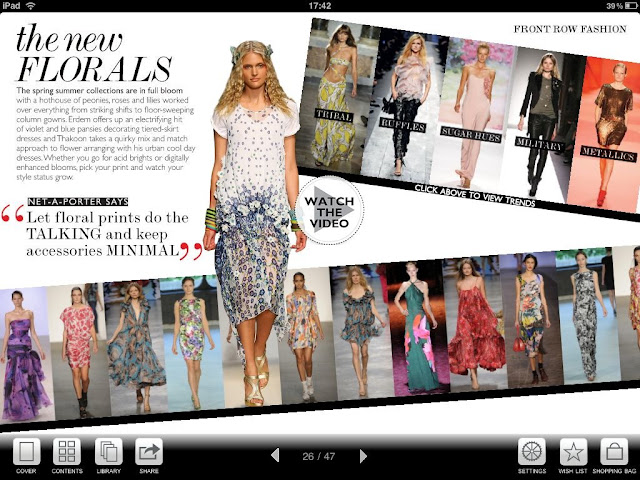
The magazine format is apparent through pages such as the one below. An assortment of garments, styled together with graphics, copy, and style tips, with a connecting product video 'Watch the Video'. Each product is also a button that can be pressed in order for the user to purchase straight from the page.
Again in the true nature of magazines, there are visual product shoots, where the products can be bought directly...
and trend pages, yet interactive and customised. By choosing one of the trends in the top row of images, the central model image changes as does the text and copy to apply the selected trend. The bottom row of images changes to reflect the trend and to allow users to buy certain pieces that the retailer stocks.
The page below is stunning. The five models in a row here are all videos that automatically show the the models walking down the catwalk on a loop. I make reference to my previous blog post about the uptake of video. Please pay attention.
Audio has been implemented also, as you an see the audio button in the top right of this next image.
I wish I could blog each and every page of this magazine as they are all so beautifully designed, yet it would take away your enjoyment of viewing them for yourself.
If you have an iPad, get this app straight away and flick through each page to gain the overall elegance and quality of this innovation. If you do not have an iPad, this app is reason enough for you to go out and buy one straight away. Have fun!
Victoria Magrath, 26/11/2010.


No comments:
Post a Comment